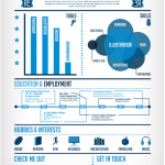
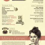
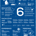
My sister recently asked me to looked at her resume for some advice on how she could spruce things up. So she sent it over and it seemed fine overall, just your typical chronological list resume with Contact info in the header and then a reverse chronological order of jobs etc… So I said to myself, how can I make this better, and besides adjusting some content item’s she did a nice job with that.. I though let’s modernize her design.
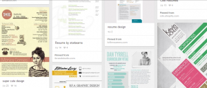
So I decided to look for some templates or some Word file(s) that may be helpful. I came across this link. 50 Awesome Resume Designs That Will Bag The Job , this has some very creative and inspirational designs, and it really got me thinking… First off this is a link of Resume designs mostly by and for graphic designer professionals, so keep that in mind. It’s their trade to build quality designs and nothing says I had mad design skillz then a sharp looking resume. I also agree as the site mentions this type of creative CV (Curriculum Vitae fancy Latin word for resume , typically used by specific industries of overseas) may not work for more stodgy industries like law , finance or medicine, for most folks some flair in your design will help.
Nonetheless, I tend to feel that a modern resume shouldn’t be the old 1950’s era , boring list of past jobs or experience, indented x spaces with only one font, double spaced..yada yada.. yada.. rather it should be something a little more modern, focused on a person’s accomplishments, but designed in such a way that tells the reader , and more importantly hopefully your prospective employer your are a quality innovative person, who has vision and isn’t afraid to show it.. It also will help differentiate you from pile the old school resumes. People tend to forget that while hiring manager(s)/employers may have a grey hair or two, the truth is there’s a whole younger generation out there in the workforce that isn’t tied to old fashion notions of what a proper resume should look like, and a lot of those younger folks are doing the hiring..
Also let’s not forget that your paper resume could just be part of your CV package, including a one-two page website that highlights your accomplishments, or perhaps even a video resume is yet another way a modern job-seeker has to show-off their talents.. maybe even .. something like this blog.. all that helps to add another dimension to your personality, rather just cold hard facts on black and white paper… and people hire people they like, its not always just about aptitude but attitude and personality.
At the end of the day your resume shouldn’t look like your grandpa’s resume, we live in 2014 people!, show us your creative style, I think resume’s should be like fashion, don’t be afraid to put some flair into it’s design, just don’t go all Lady Gaga meat dress on it.
Here are some sites that offer resume free design templates or inspirational designs (Mix of MS Word and other formats):
- Google Docs Template Gallery (search term: resume)
- Resumetemplate.in
- http://smashfreakz.com/2012/08/creative-resume-template/
- Xdesings
- Pinterest Resume Templates( free)
- Microsoft Office Site (these a naturally used by many folks…)
- PrimerMAgazine Word Resume templates
- Blog on good tips not on style but content
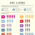
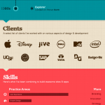
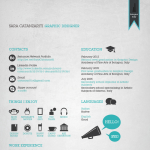
Below are some of the creative designs I liked, there are so many good ones.
